Sharon Orienza

Thomson Reuters Information Architecture and Navigation Project
The initial assignment was to provide a modern look and navigation for the eBH site. After reviewing the exit interviews the PMs had with previous customers and my own UX discovery work, I came to the conclusion that the entire site's architecture needed to be overhauled and reorganized to fit User's Mental Models and their workflow before UI design could even begin. I convinced the stakeholders that some IA work was necessary in order to create better workflows for Users.
overview
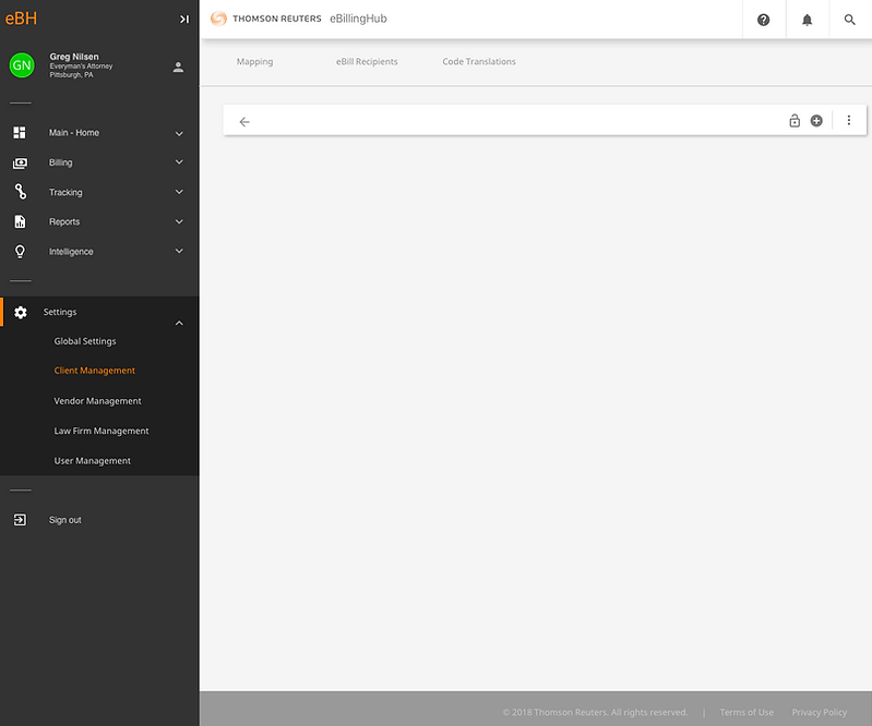
The eBH system has three products that needed to be redesigned. Two of these are customer facing, and one is an internal application:
-
The eBH Portal (basic subscription service)
-
eBH Application (more robust application with additional features)
-
eBH Admin Application
step 1 - identify the current issues (discovery)
-
Too much scrolling is required on every task - both vertical and horizontal scrolling
-
Too many tasks are placed in popups which don't allow for batch processing of some actions.
-
The Search is not an intuitive design
-
Too much time is wasted to complete redundant tasks
-
Too many tasks have side by side tables that require opening for each task.
-
Due to the site's disjointed architecture, Users are required to jump from one section to another to complete what seems to be a linear task.
-
Icons are reused throughout the site and have different meanings throughout.
-
Labels are not always intuitive nor are they consistently used throughout the site.
step 2 - identify the goals to achieve
-
Create a new architecture for the site that follows Users' workflows.
-
Streamline the workflows for each module.
-
Reduce the number of clicks necessary to complete a task.
-
Utilize usability tactics such as Progressive Disclosure to display only the task(s) at hand.
-
Design UI to function more like modern applications that are familiar to Users to reduce learning curves.
-
Make Labeling more transparent to Users so that new users can grasp the system quickly.
-
Reduce the amount of side by side tables within the application.
-
Reduce the number of overlays and popups within the workflow.
-
Make use of icons sparingly – and when used, make more intuitive visually.
-
Modernize the Visual Design of the UI.
the design problem
How do we create a workflow that makes linear sense to Users while designing a navigational flow that functions like our User's mental model of the work?

review the current state of the ia
No one on the development or Customer Care team was able to provide a recent sitemap of any of the applications. My first priority was then to walk through the entire application and create a sitemap of its current state.
cardsort exercise

I developed a card sorting exercise to help understand the workflow better. Business at the time did not feel comfortable approaching actual users of the customer-facing application, so I had to improvise and use the teams that worked closely with Users. The exercise was performed by 3 eBH teams: Development, Customer Care and the Customer Implementation teams.
There were discrepancies amongst the teams (and even within the teams themselves) as to where some items should reside. It was clear to me, based on the results and the sitemap developed from those results, that additional work was needed to create a cohesive workflow.
view the report:
eBH Card Sort
affinity diagramming exercise and workshop
To finesse the sitemap that evolved from the card sorting exercise, I created an Affinity Diagramming exercise and conducted a series of workshops, in person and online, for the Customer Service team to give me more insight into the workflow of these tasks. The Customer Service team was singled out as it was evident from their card sort comments that they were most in tune with User's day to day task.
The workshops were conducted over a period of one week. In-person workshops were done with post-it notes for a very low-fidelity, tactile experience, while online workshops were conducted through an application called Realtime that simulated a post-it noteboard.
view the report:
Affinity Diagramming Report

the resulting ui